Introduction
In today’s digital age, where competition is fierce, building a website that effectively converts visitors into customers is crucial for success. A visually appealing site alone is not sufficient; it must also offer a user-friendly experience that directs visitors toward taking action. By utilizing strategic design elements like tooltips on mobile, businesses can enhance user engagement and increase conversion rates. In this blog, we will explore essential strategies for designing highly converting websites, focusing on user behavior, fundamental design principles, the effective use of tooltips, and more to ensure that your online presence drives meaningful results.
How to Design Websites that Convert Visitors?
1. Understanding User Behavior
Understanding user behavior is fundamental to creating a website that converts. Here’s how to do that:
- Analyzing Visitor Interactions: Monitoring how users interact with your site can provide insights into their preferences and challenges. Utilizing tools like Google Analytics allows you to monitor metrics like bounce rates, time spent on pages, and click-through rates, helping you identify which areas need improvement.
- Creating User Personas: Develop detailed user personas that represent your target audience. By understanding their goals, pain points, and motivations, you can customize your website design to address users’ specific needs, which can ultimately result in higher conversion rates.
- Utilizing Heatmaps: Heatmap tools visualize user interactions on your site, showing where visitors click, scroll, and spend the most time. This information can help refine your design and content placement, making it easier for users to find what they need.
Leverage Nudge’s user feedback tools to gain insights into user preferences and optimize your website’s design for higher conversions.
2. Key Design Principles for Conversions
Implementing effective design principles is vital for creating a user-friendly website. Here’s how to do that:
- Simplicity and Clarity: A clean, uncluttered design helps users focus on essential elements without distraction. Ensure that your layout guides visitors naturally toward the desired actions, like signing up or making a purchase.
- Effective Use of Space: White space is your friend. It enhances readability and helps users concentrate on your content. A well-spaced layout can make your website feel more organized and inviting.
- Color Psychology: Colors evoke emotions and can significantly impact user behavior. Use color schemes that are consistent with your brand identity while also prompting action—such as using contrasting colors for CTAs—to encourage users to engage with your content.
3. The Role of Tooltips on Mobile
Tooltips on mobile are a powerful yet often overlooked feature that can enhance user experience on mobile devices.
Definition of Tooltips
Tooltips are small informational pop-ups that provide context or additional information when users hover over or tap on specific elements. Tooltips on mobile offer a way to deliver guidance without cluttering the screen.
How Tooltips on Mobile Can Help?
- Enhancing User Experience: Tooltips can clarify complex features or actions, helping users understand their next steps without overwhelming them. This is particularly important on mobile devices, where screen space is limited, and users may need concise guidance.
Designing Effective Tooltips
Ensure tooltips are visually appealing, easy to read, and appear at the right moment. Avoid excessive text; instead, use brief, informative language that adds value to the user’s experience.
4. Crafting Compelling Calls-to-Action (CTAs)
Strong CTAs are crucial for converting visitors into customers. Here’s how to create compelling CTAs:
- Visibility and Design: CTAs should stand out on your website. Use contrasting colors, larger fonts, and strategic placement to draw attention. Ensure they are easily identifiable and placed where users are most likely to see them.
- Action-Oriented Language: Use persuasive and clear language that communicates the value of taking action. Phrases like “Get Started,” “Shop Now,” or “Join Free for a Month” encourage users to click.
- Testing CTAs: A/B testing different CTAs can reveal which phrases, colors, and placements drive the highest conversions. Regularly updating and optimizing your CTAs based on performance data can significantly enhance results with tooltips on mobile.
5. Optimizing for Mobile
With a majority of users accessing websites via mobile devices, optimizing for mobile is non-negotiable. Here’s how to do that:
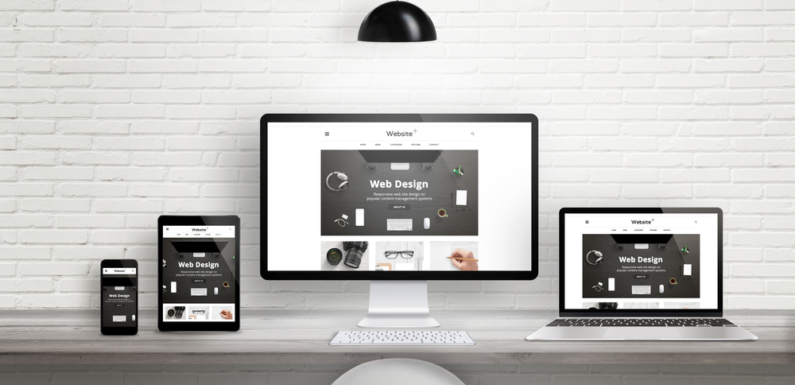
- Responsive Design Principles: Ensure your website is mobile-responsive, meaning it adapts seamlessly to different screen sizes. This enhances usability and encourages longer visits, leading to higher conversion rates.
- Testing for Mobile Usability: Use mobile testing tools to evaluate how well your website performs on various devices. This includes checking load times, navigation ease, and overall user experience.
- Load Speed Considerations: Mobile users expect fast-loading websites. Research indicates that delays can lead to abandonment, so optimizing images, minimizing redirects, and using efficient coding practices are essential.
6. Integrating Feedback Mechanisms
Gathering and integrating user feedback is crucial for ongoing improvement. Here’s how you can do that:
- User Feedback Tools: Implement surveys or feedback forms to capture user insights. This can help identify pain points and areas needing enhancement.
- Making Data-Driven Changes: Analyze feedback and user behavior to inform design decisions. This iterative process ensures your website evolves in line with user expectations.
- Continuous Improvement: Regularly revisit your website’s design and functionality based on feedback to maintain a highly converting site that meets user needs.
Utilize Nudge’s survey and feedback solutions to continuously improve your website based on real user input, ensuring a seamless experience.
Conclusion
Designing a website that converts visitors requires a strategic approach grounded in understanding user behavior, implementing effective design principles, and utilizing tools like tooltips on mobile. By focusing on simplicity, optimizing for mobile, and continually seeking user feedback, businesses can create a highly converting online presence.
Ready to enhance your website’s design and boost conversions? Partner with Nudge to implement tailored strategies that create engaging user experiences and drive results. Book a demo today!


